


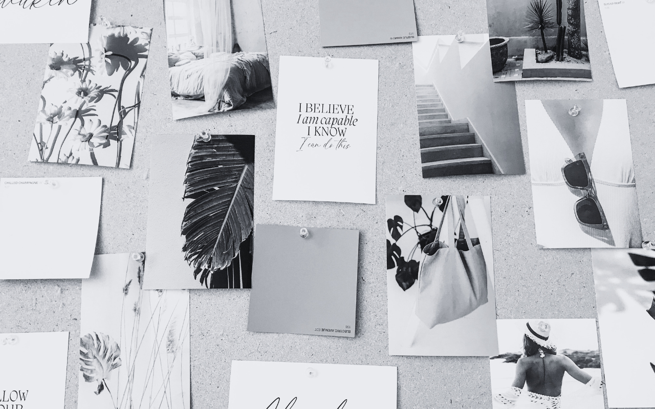
If your brand palette feels a little too safe, or worse — forgettable, it might be time to lean into colour with intention. We believe your visual identity should feel magnetic from the very first glance. One of our favourite ways to infuse that magic? A curated purple.
Purple is often overlooked in the world of branding. But when used right, it communicates depth, elegance, emotional resonance, and creative spirit. We’ve curated six standout purple tones that embody all of that and more—designed to bring visual sophistication, richness, and mood to your brand presence.
Let’s meet your next brand colour crush.

1. Velvet Amethyst
HEX: #392C39
Deep, plush, and regal—with all the jewel-toned depth you’d expect from a luxury brand. Velvet Amethyst evokes richness, mystery, and emotional resonance. Perfect for creative professionals, beauty brands, and coaches wanting to exude wisdom and warmth.

2. Dusky Orchid
HEX: #E8C7DA
Soft, feminine, and grounded. Dusky Orchid is the perfect blush-lilac hybrid with an earthy, dusk-like undertone. It’s gentle yet commanding and works beautifully in wellness, beauty, and holistic brand palettes.

3. Imperial Fig
HEX: #B37B9E
This is your moody muse. Imperial Fig feels ripe, dramatic, and full of old-world richness. Think artisanal elegance, vintage storytelling, and high-end editorial. It’s ideal for soulful creatives, artists, and photographers.

4. Lavande Noire
HEX: #D9C3DC
Light and airy with a sultry, Parisian twist. Lavande Noire is a lavender shade that balances modern softness with vintage flair. This tone works beautifully for stylists, designers, and feminine-forward lifestyle brands seeking refinement without rigidity.

5. Plum Mirage
HEX: #A5595F
Dreamy, dark, and surreal—Plum Mirage is that late-night inspiration, brought to life. Its soft ethereal glow makes it perfect for spiritual coaches, creatives, and brands wanting to feel grounded and intuitive yet impactful.

6. Violet Smoke
HEX: #855269
Muted and mysterious. Violet Smoke is sophisticated with just enough edge. With its grey undertones, this shade balances emotional depth with modern restraint—great for luxury service-based businesses and psychology or wellness brands.
Why Your Brand Colour Story Matters
Your colour palette is doing a lot more work than you think. It’s often the first impression, the emotional hook, and the silent storyteller of your brand identity. The right purple, for instance, can say: “We’re confident, creative, and wildly original.” The wrong one? “We’re dated.”
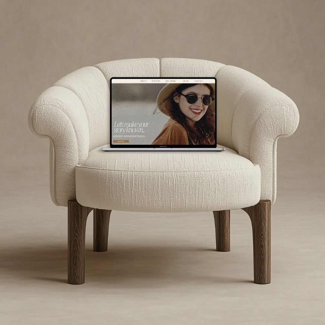
At She Glows Creative Co., we curate your entire sensory brand experience. From website design to custom templates and full brand kits, we build visuals that speak your brand’s truth before you even say a word.
Time to glow (in purple)
If your current colour palette is feeling meh instead of magnetic, it might be time for a rebrand.
Let’s create a brand presence that feels like you — bold, intentional, and unforgettable.


Comments +